Page 1 of 4
Icons: Visiual Metaphors
Posted: 30 Mar 2013, 17:30
by sirherrbatka
How GMST icon should look? So far majority of suggestions were focused on some sort of binary files like look. Is that ok?
Re: Icons: Visiual Metaphors
Posted: 30 Mar 2013, 18:12
by HiPhish
How about writing the letters GMST onto the icon? That's as clear as it gets and it should still be readable enough at 22x22, here is a very quick & dirty mockup:

(obviously someone with more time and skill could find a better font, I just took what I had selected from last time)
Re: Icons: Visiual Metaphors
Posted: 30 Mar 2013, 18:16
by sirherrbatka
Works for me.
Re: Icons: Visiual Metaphors
Posted: 02 Apr 2013, 17:37
by sirherrbatka
I can't find a good way to extinguish top level recrod type from referencable type. I was thinking about using background but this would leave referencable type inconsistent.
Another option would be frames around both referencable and top level record types in different colors.
Any ideas?
Re: Icons: Visiual Metaphors
Posted: 02 Apr 2013, 17:53
by riidom
You could sketch a folder structure to indicate a level, like I did here with the container icon proposal:
download/file.php?id=149
This could indicate "top level", while for a sublevel, you could make smth like " L, " where L is the tree and , the icon you want to use. This means ofc, the icon cant use the whole area, more like 1/4 of it.
Re: Icons: Visiual Metaphors
Posted: 02 Apr 2013, 19:00
by sirherrbatka
more like 1/4
This conflicts with the hierarchy of information.
Oh well I will just start to make icons. We can think about this later.
Re: Icons: Visiual Metaphors
Posted: 03 Apr 2013, 10:42
by sirherrbatka
Re: Icons: Visiual Metaphors
Posted: 19 May 2013, 09:13
by sirherrbatka
Ok, nomadic1 made majority of easier icons. We are facing the following
version information ─ maybe "i" as in information?
global variables ─ maybe "var"? Does anybody have a better idea?
Classes ─ no idea
Factions ─ maybe a baner?
http://www.rameset.com/images/Banner 1.gif
races ─ no idea
skills ─ I liked the hand icon for it, but we use speech bubble with hand as a "Ave!" icon
regions ─ wind rose
birthsigns ─ any birthsign
land lextures ─ map and the paintbrush
body part ─ any body part (not a head or hand, maybe a torso)
enchatment ─ magic wand
cell ─ dunno
pathgrid ─ a grid
land ─ map
spell ─ a magic scroll with a wand.
Re: Icons: Visiual Metaphors
Posted: 19 May 2013, 10:30
by Zedd
I would suggest not to make a map for land but just a landscape and a magic beam for spells instead of a magic scroll and a wand, making the dissimilarity more obvious.
As for the remaining ones:
-A transparent cube for cell
-A face with features from two well known races for both sides, or, maybe better put, two half heads from two races merged together, or, if you are in the mood and you want to make an abomination, a Frankenstein with strips of flesh from all races available in Morrowind!
-Maybe some progression bars for skills, maybe in medieval style, I'm not sure this is a good idea though.
-Best I can think of for classes would be the three different weapons/items used by the 3 major types of gameplay (magic, combat,stealth). It's a lot of elements but I can't think of anything better now.
Re: Icons: Visiual Metaphors
Posted: 19 May 2013, 19:02
by Tarius
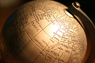
I know there isnt a ton of room, but this should give some ideas.
globals
http://www.elated.com/res/Image/article ... /globe.jpg
classes
http://eonsepochsetc.com/Resources/Imag ... cation.jpg
or maybe something similiar to this:
http://4.bp.blogspot.com/_Gct8lVAxKqQ/S ... cetree.png
Factions, I like the banner idea.
races
Yea, put an orc head next to an elf head or something.
Body part, yea, put a leg and a foot.
Enchantments
I would really think something like a wand with 'sparkles' at the end touching a helmet or something
Spell
I would go with a hand with a magic shining orb or something.