
New draft:
(link removed)
Ok now before you say anything: I have requested permission to use that image. It's fanart, so I was able to locate the artist and email him. No reply yet, but this was just a few minutes ago. I have credited him on the image.
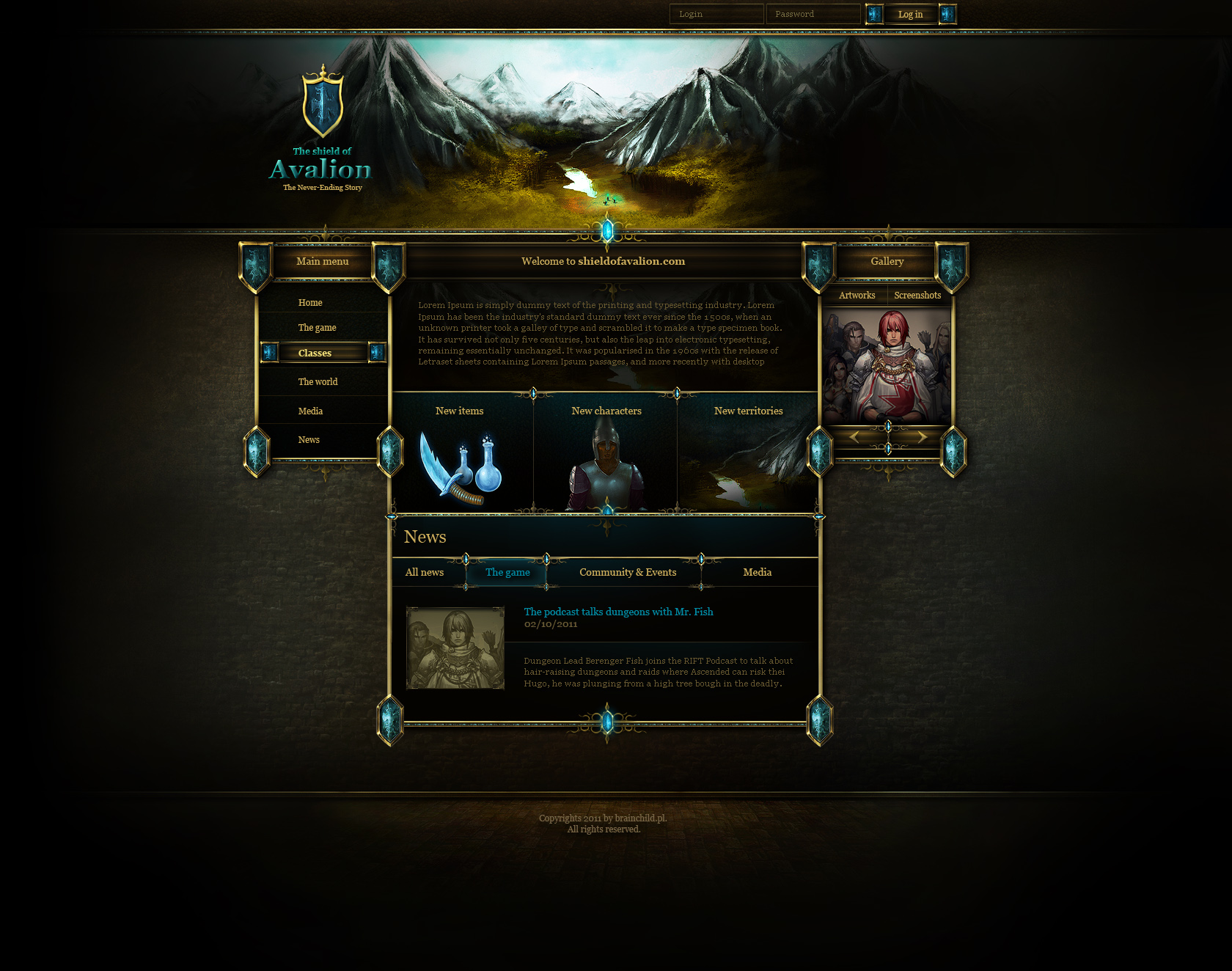
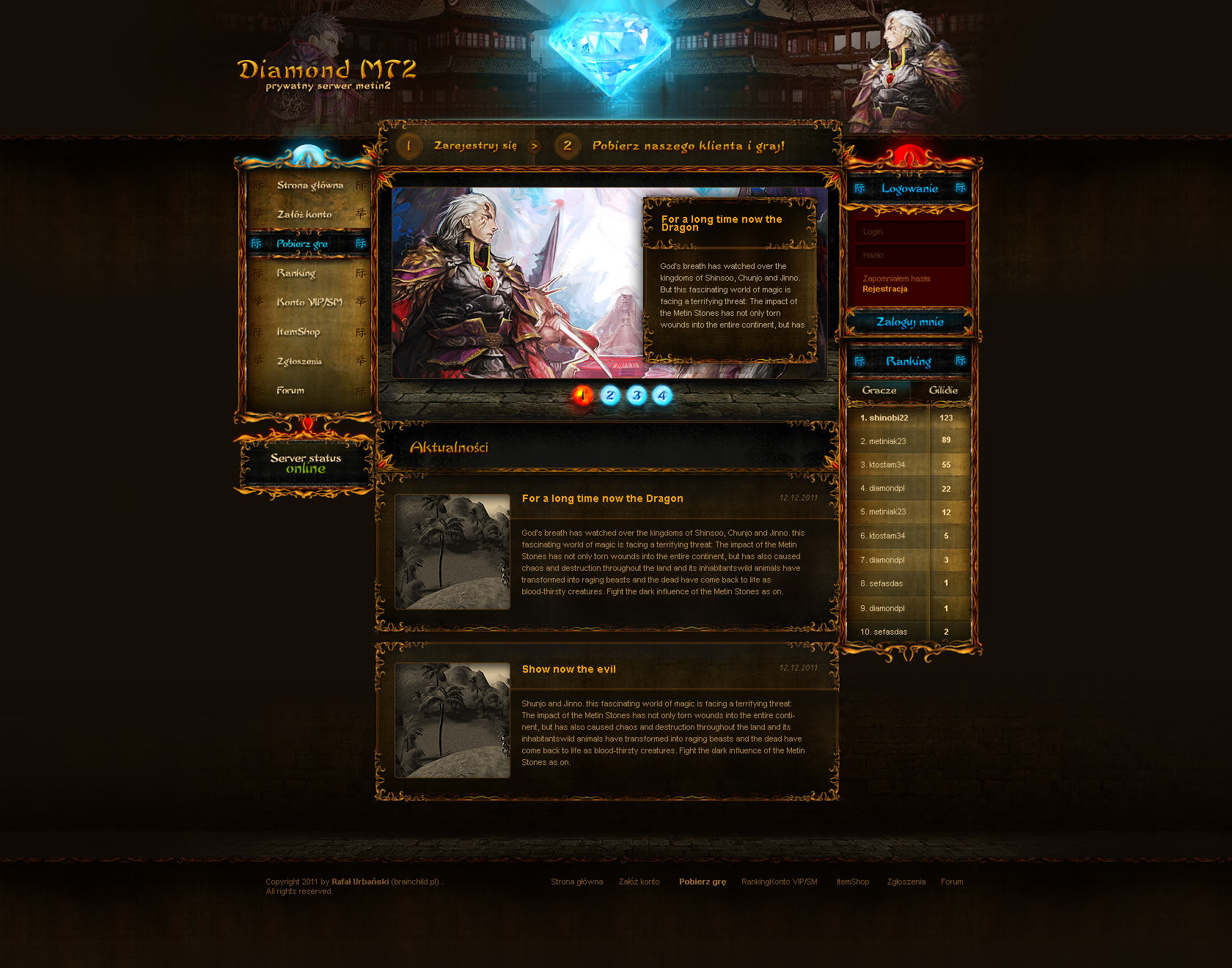
What do we think about this? I think it's an awesome image and really works for the page. I'm also using a cropped and desaturated version of the image, so it's a little derivative. But if he does give permission to use it, are you guys ok having that little credit notice on it?
EDIT: Another question. I am using a fixed width for the page, because that's just the way the world works. What's everyone's preference on widths? This draft is 1000px, previous ones have been 800. Both work for me.
EDIT EDIT: Just so you guys know, once one of these drafts has passed consensus, I plan to fix the blockiness of some/most of the elements to make it easier on the eyes. That just takes a bit more time, so I am throwing these drafts together like this to give impressions.
Website design proposal(s)
Re: Website design proposal(s)
Last edited by raevol on 17 Aug 2011, 08:10, edited 1 time in total.
-
lgromanowski

- Site Admin
- Posts: 1193
- Joined: 05 Aug 2011, 22:21
- Location: Wroclaw, Poland
- Contact:

Re: Website design proposal(s)
Even better.
Well, the problem with fixed width is that it does not work (unless you happen to match exactly the width of the browser window). I won't make a fuss about the fixed width on the main site, but can we at least avoid it on the wiki and the forum? We had fixed width on the old forum and at least for me it was a huge usability burden.EDIT: Another question. I am using a fixed width for the page, because that's just the way the world works. What's everyone's preference on widths? This draft is 1000px, previous ones have been 800. Both work for me.
Re: Website design proposal(s)
From a graphic design perspective, variable width is an absolute nightmare. That said, for the wiki it's absolutely necessary. For the forum, I would definitely like it to be variable width, but I'll have to see what I can do when I get there.Zini wrote:Well, the problem with fixed width is that it does not work (unless you happen to match exactly the width of the browser window). I won't make a fuss about the fixed width on the main site, but can we at least avoid it on the wiki and the forum? We had fixed width on the old forum and at least for me it was a huge usability burden.
-
sirherrbatka

- Posts: 2159
- Joined: 07 Aug 2011, 17:21
Re: Website design proposal(s)
@raevol
I like it. Very well done
I like it. Very well done

Re: Website design proposal(s)
Woa, nice !
The only thing I dislike is the "Body Element Title" white background, and the black color of the font of the article.
Except those things : great job !
The only thing I dislike is the "Body Element Title" white background, and the black color of the font of the article.
Except those things : great job !
Re: Website design proposal(s)
I would like to propose a different sequence for the navigation bar:
This moves all informational items to the left and all interaction items to the right, each starting with the most important item at the left end respectively at the the right end of the bar.Main Media Download FAQ Team Bugs Wiki Forum
-
sirherrbatka
- Posts: 2159
- Joined: 07 Aug 2011, 17:21
Re: Website design proposal(s)
Well, I guess that every single user agreed that new skin is pretty. So, are you gonna keep this look?
Re: Website design proposal(s)
Agreed.ap0 wrote:The only thing I dislike is the "Body Element Title" white background, and the black color of the font of the article.
Agreed.Zini wrote:I would like to propose a different sequence for the navigation bar:
Yep! Though I haven't heard back from the artist yet. I'll start looking for a new image. But I'll get to work beautifying this design too.sir_herrbatka wrote:Well, I guess that every single user agreed that new skin is pretty. So, are you gonna keep this look?